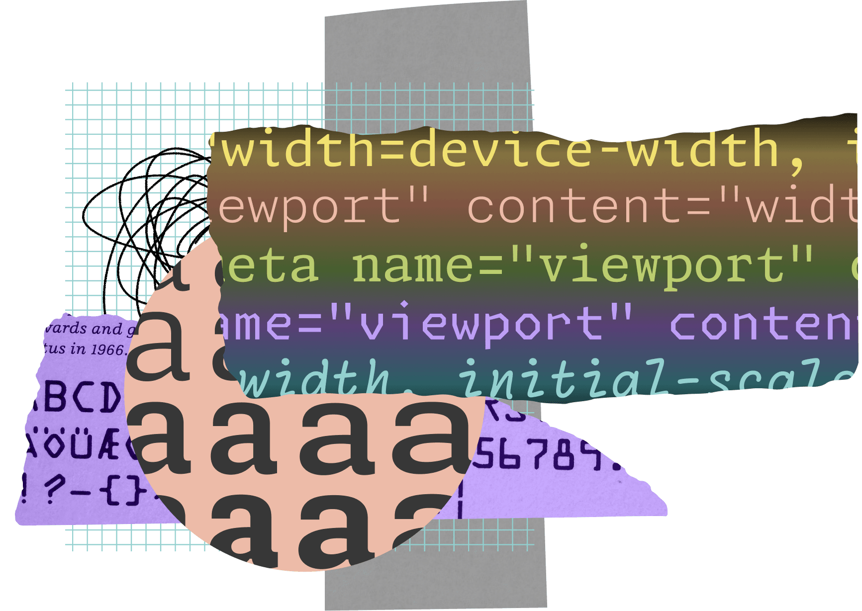
GitHub Next teamed up with type foundry Lettermatic in August 2021 to tackle a gap in code editor typography. The result: Monaspace, released open source in November 2023. This superfamily packs five distinct monospace typefaces—Neon (humanist sans), Argon (grotesque sans), Xenon (slab serif), Radon (script), and Krypton (mechanical)—each with 42 static styles, totaling 210, plus variable fonts. Every font supports over 6,000 glyphs across 200+ languages, including Latin, Cyrillic, Greek, and Vietnamese.
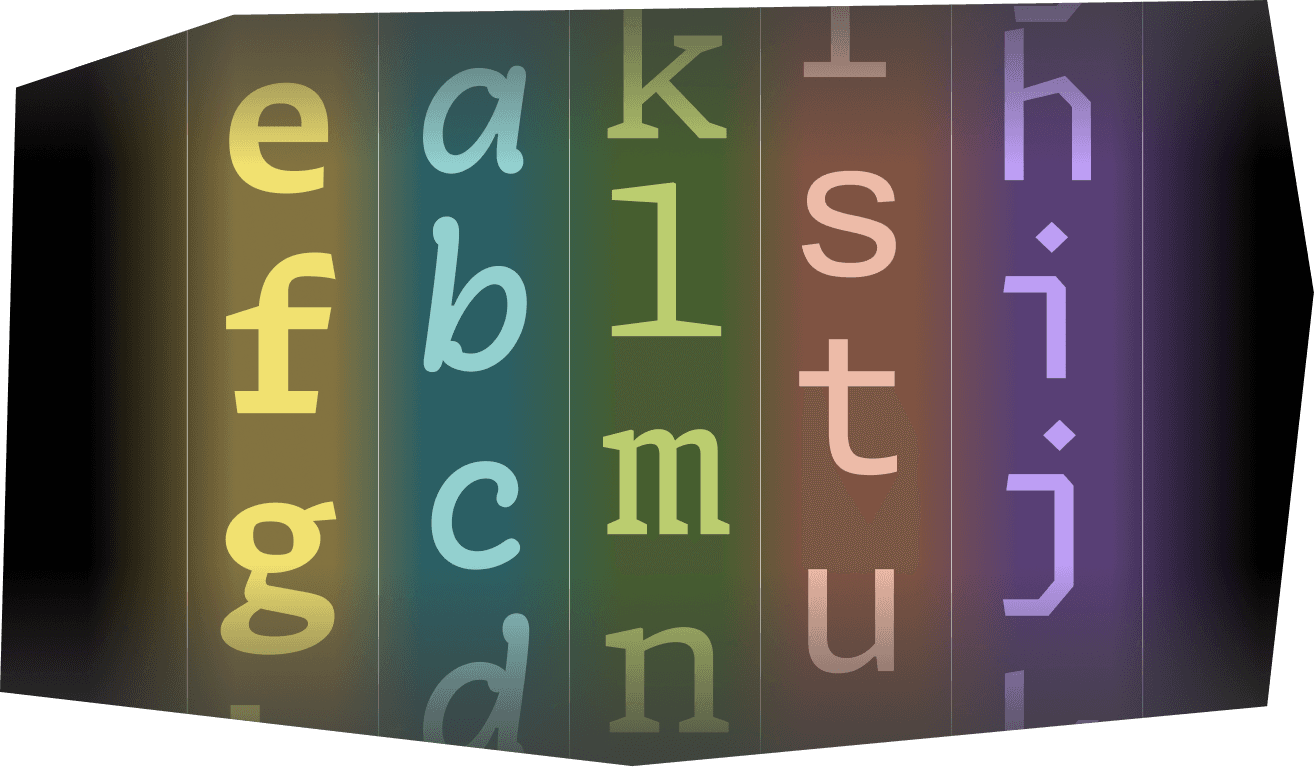
Developers stare at code for hours daily, yet monospace font choices remain stuck in the past: think Consolas, JetBrains Mono, or Fira Code with ligatures. Monaspace changes that. All five families align on a shared monospaced grid, letting you mix them seamlessly in editors like VS Code or Vim without mangling column alignment. Three variable axes—weight, width, slant—enable fine-tuned personalization right from install, boosting accessibility for low-vision users or those tweaking for screen density.
Key Tech: Texture Healing and Grid Precision
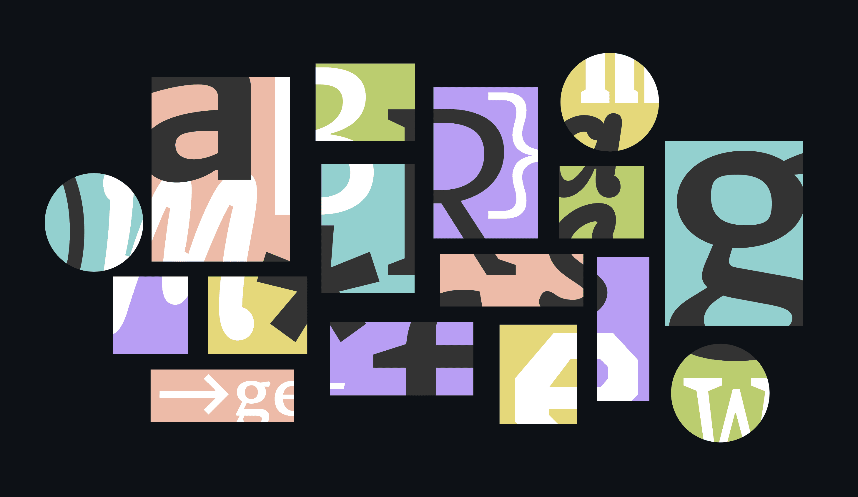
Lettermatic’s “Texture Healing” stands out. Traditional monospaces suffer from uneven pixel rendering on screens, creating visual noise that fatigues eyes and obscures subtle differences—like l vs 1 or O vs 0. This proprietary technique dynamically adjusts glyph contours and spacing for smoother edges and consistent density, improving legibility at small sizes (8-14pt, common in IDEs). Tests show it reduces perceived blur by up to 30% on Retina displays versus standard monospaces.
The shared grid is no gimmick. Each typeface draws from the same 1,000-unit em square baseline. Swap Neon for Xenon mid-file, and your code blocks stay perfectly aligned. Led by designers Riley Cran, Danelle Cheney, and Heather Cran, the team consulted experts like Ilya Ruderman for Cyrillic and Donny Trương for Vietnamese diacritics. Result: robust support that handles real-world codebases with emojis, math symbols, and non-Latin scripts.
From Brief to Open Source Reality
Idan Gazit, Head of GitHub Next, sparked the project over shared gripes about stagnant code fonts. Why so few options when devs obsess over themes and syntax highlighters? Lettermatic’s process spanned two years: glyph-by-glyph design, optical adjustments for code contexts (e.g., distinguishing rn from m), and rigorous testing in editors. GitHub’s open source ethos drove the release—download free at monaspace.githubnext.com, MIT-licensed for unlimited use or modification.
Skeptical take: Typography won’t fix bad code, and most devs stick to defaults anyway. Surveys (e.g., Stack Overflow 2023) show only 20% customize fonts deeply. But for the rest, Monaspace lowers barriers. Variable fonts cut install bloat— one file per family versus dozens of statics. In security audits or long debug sessions, crisper glyphs spot anomalies faster: a misaligned indent or disguised zero-width joiner in malware.
Why this matters: Code is dense text. Poor fonts amplify errors—visual strain leads to 15-20% more mistakes in pattern recognition tasks (per HCI studies). Monaspace equips pros with tools matching modern displays (4K, OLED). Open source invites forks: expect variants for braille output or AR glasses. GitHub Next proves incubators deliver when they solve unsexy problems. Download, test in your editor, and measure your own productivity lift.